TOP TALK

Posted By Grace Rasulo on May 03, 2017
No matter what industry you’re in, it’s imperative to maintain a strong company website. Afterall, it’s a prospective customer’s first impression of your company. While there is no standard rule on how frequently a business needs to update its website - some experts advise changes every couple of months while others recommend every couple of years, depending on your audience’s needs. So, how do you keep your best digital foot forward?
To get you started, we’ve delved through some of the most engaging, eye-catching and impactful sites out there to identify the elements that make these sites effective. Whether you’re doing the work yourself or communicating concepts to a developer, use these tips to inspire your own digital revamp and ensure your website continues to deliver for your company.
Remember the 5 W’s
Who, what, when, where, and why are classic for a reason; they’re important! As your company evolves it’s important that the Home Page of your website continues to clearly and quickly communicate who you are and what you’re all about. The worst company websites sites make you hunt for basic information. The best sites anticipate and answer these questions upfront.
Keep It Simple (and Clearly Labeled)
Limit the number of pages on your website, focusing on keeping it as clean, succinct, and organized as possible to avoid information overload. Prioritizing clarity over specificity keeps your information digestible; too much text can be overwhelming and will put readers into “skim” mode. A page’s header shouldn’t be longer than one to three words.
On the technical side of things, the most efficient sites have a streamlined site map. Keep your user on the straight and narrow to the information they’re seeking. The goal is to make finding what you’re looking for as easy as possible by providing a direct path. If users have to dig too much, you might lose them.
Design with Intent
Effective company websites understand that decorative components should complement material on the page, not distract from it.
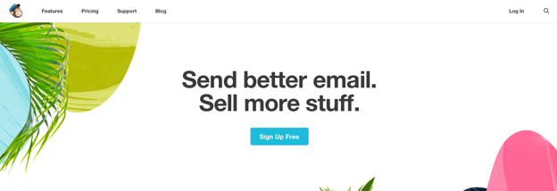
Use color strategically. Avoid splashing color all over the page, but rather use it when you want to make something pop. A neutral background lets you use color to draw attention to certain bits of information. Mailchimp uses this technique beautifully on its homepage. When it comes to color palette, stay within your brand’s style guide for consistency. Limiting the number of colors used on fonts, buttons, and tabs throughout the site keeps things easy on the eyes and cohesive across multiple pages.
Use of colorful photos can be an exception to this rule, but should still be complementary to your color scheme.
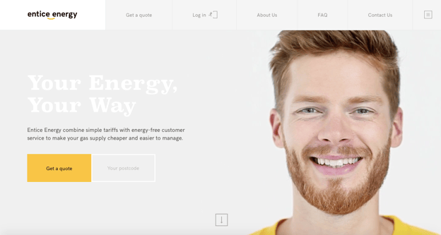
Another great example of a company employing this strategy is Entice Energy, carrying its simple gray, white, and yellow color scheme across the entire homepage down to the spokesman wearing its signature yellow.
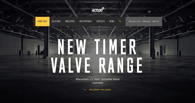
When used appropriately, photos add a nice touch to a corporate site. For page sections that don’t include much text (like headers), setting a photo or video as a background can add visual interest, as long as the image isn’t too busy or it can distract from the text. Acme World's homepage exhibits this perfectly, by using bold white text high-quality images that help tell the brand’s story instantly. Note how the images select represent the brand’s persona and appeal to the target audience; genuine messaging goes a long way.
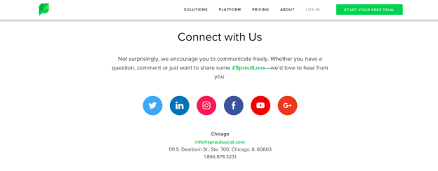
Make it Easy to be Social
Make it easy for visitors to your site to find your accounts, share your content, and connect with your brand on social media. Prominently display your social profiles on your site and don’t forget to include a “share” option at the end of every blog for maximum engagement.
Final Thoughts
What does the perfect website look like? There is no one answer. The main objective is making your website as easy for your audience to use as possible, while conveying your brand’s personality. Consider what your audience wants and needs; if you can cater to both, your company website and your brand overall will resonate with your audience on a whole new level.
Want to learn more? Here are other great site design resources:
- HubSpot: 5 Steps To Designing A Great Company Website
- Forbes: Top Tips: 10 Elements Of Any Effective Website
- Code My Views: 10 Crucial Elements for Any Website Design
Written with help from Christie Leist.